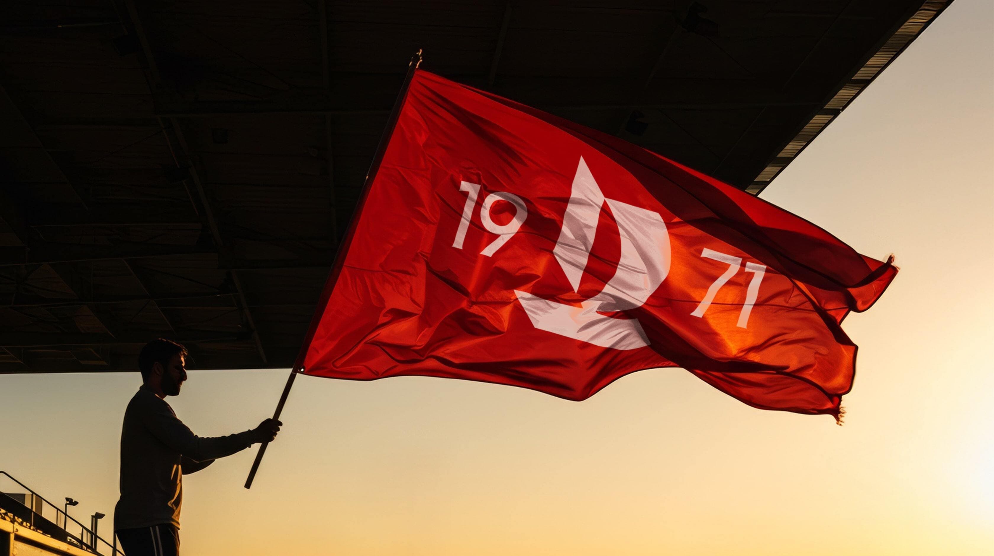
BAHRAIN RUGBY CLUB
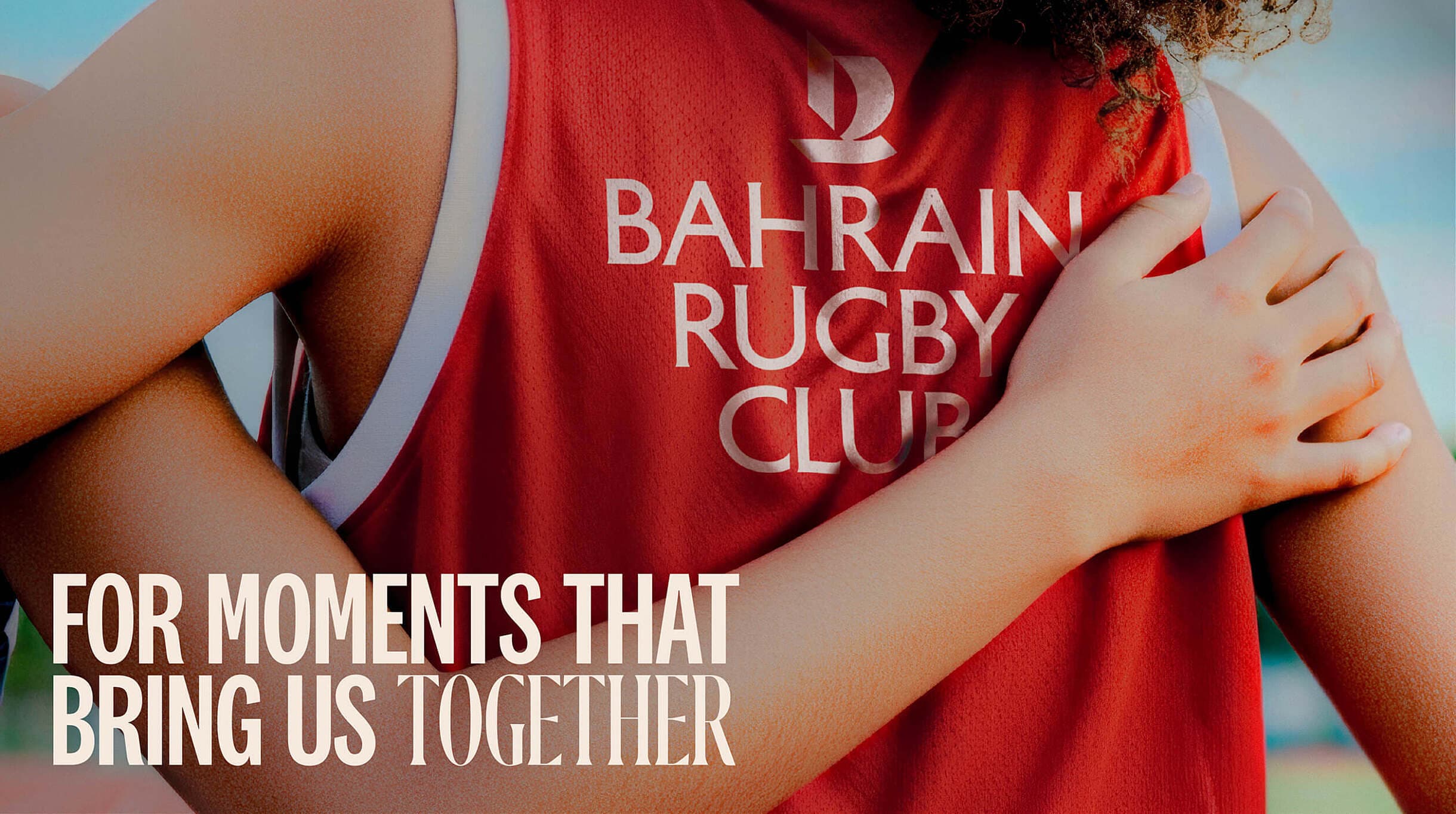
/FOR MOMENTS THAT BRING US TOGETHER
Partner Story
Evolving a club with heart
A new era of belonging.
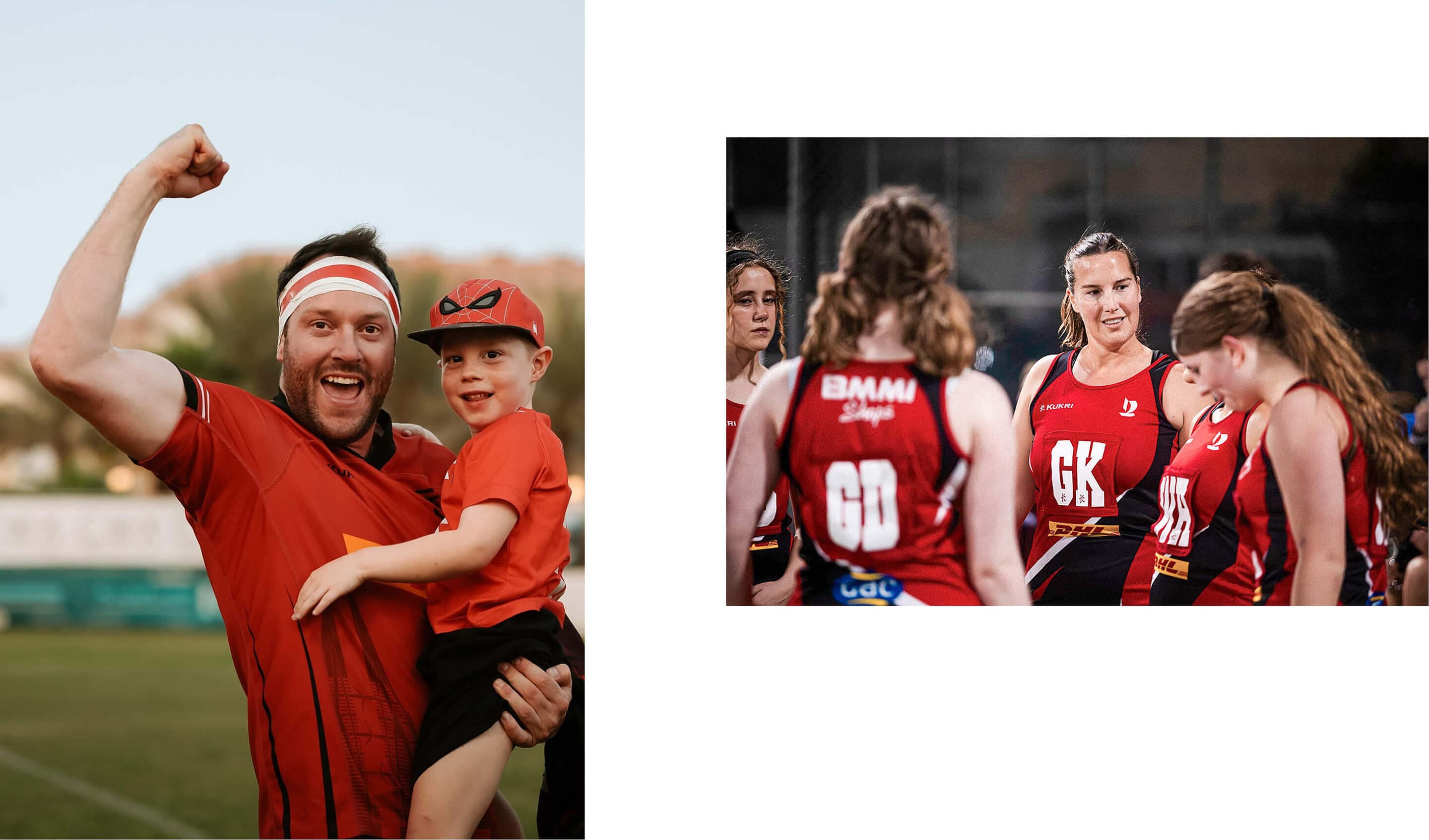
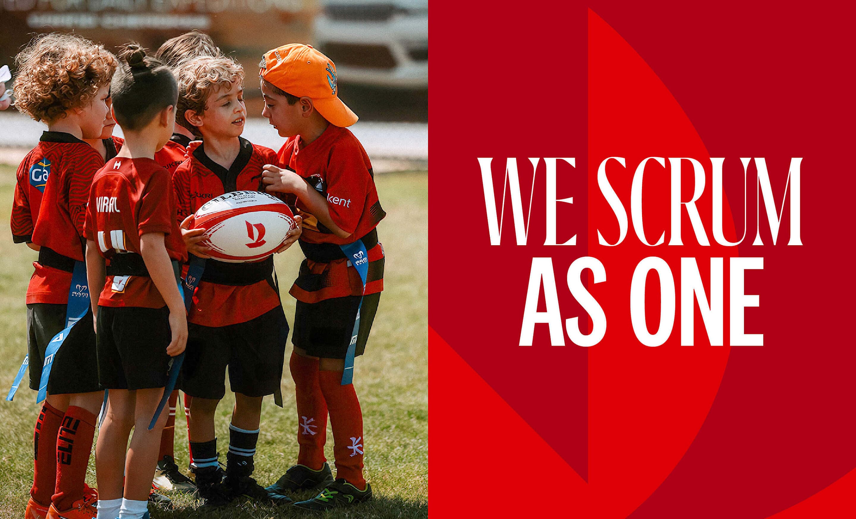
BRC has always been more than a sports club. It's a space where friendships are formed, traditions are shared, and people from all walks of life feel welcome. As the club grows and its community evolves, so too must its identity.
We partnered with BRC to define a future-facing brand rooted in its culture of togetherness. A refreshed strategy, new visual language, and clear purpose — designed not to reinvent, but to realign the club with what it has always been at its core.
Client
Bahrain Rugby Club
Services
Brand Strategy
Brand Identity
Concept Development
Marketing Campaign
Brand Launch Campaign
Social Media
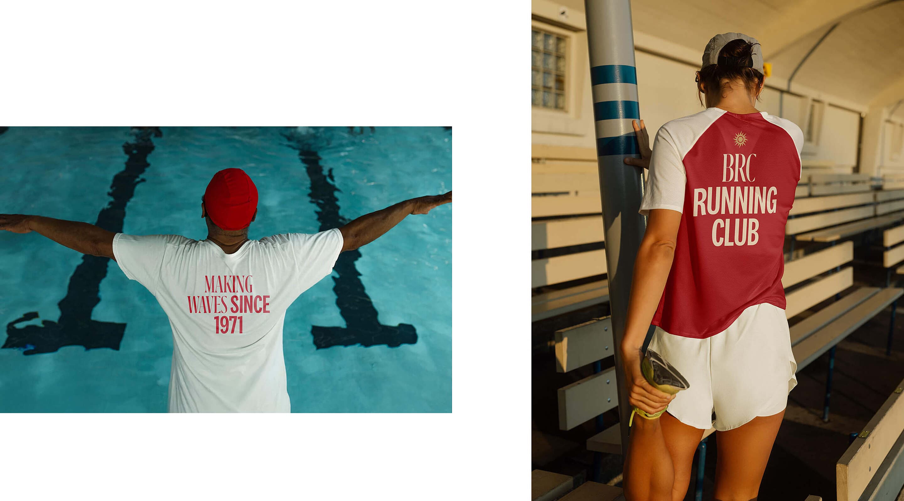
Apparel
_FOR MOMENTS THAT BRING US TOGETHER
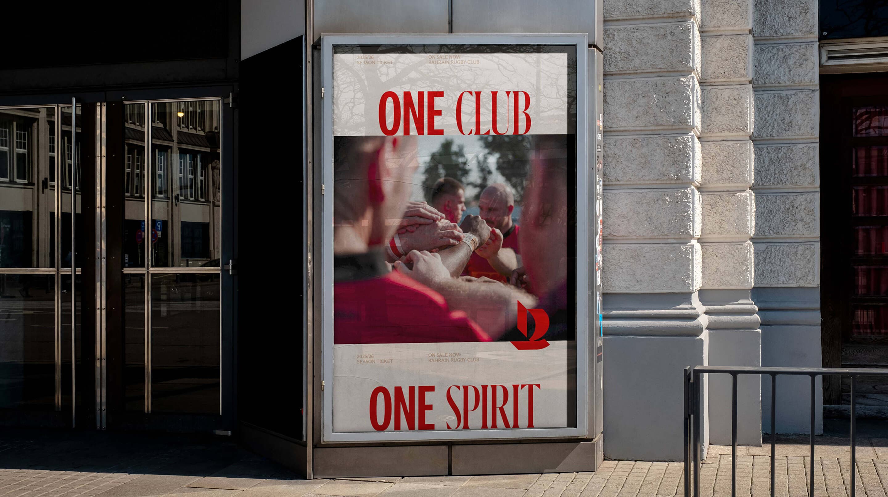
Repositioning with clarity and intent. BRC’s strength lies in the everyday, shared moments that build a sense of belonging. The brand centres on this idea: not just a place to compete, but to connect. For moments that bring us together captures that spirit, offering a message that feels open, inclusive, and true to life at the club.
/A SYMBOL SHAPED BY PLACE AND PURPOSE
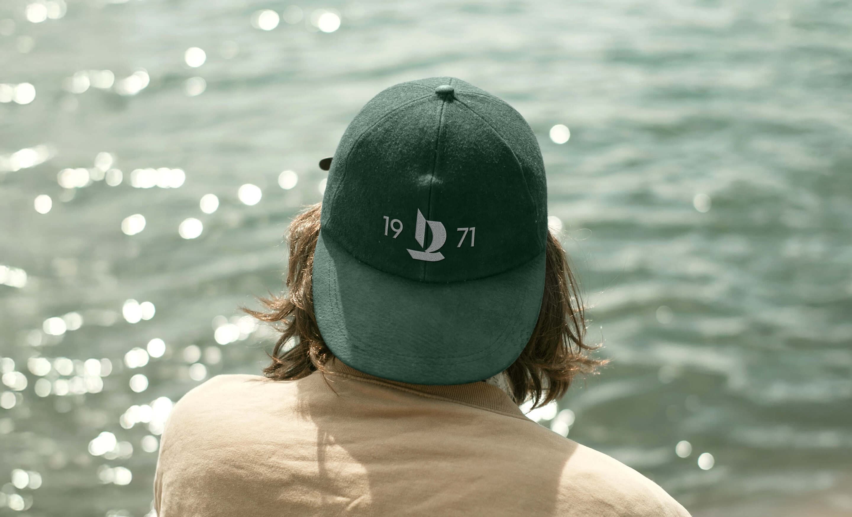
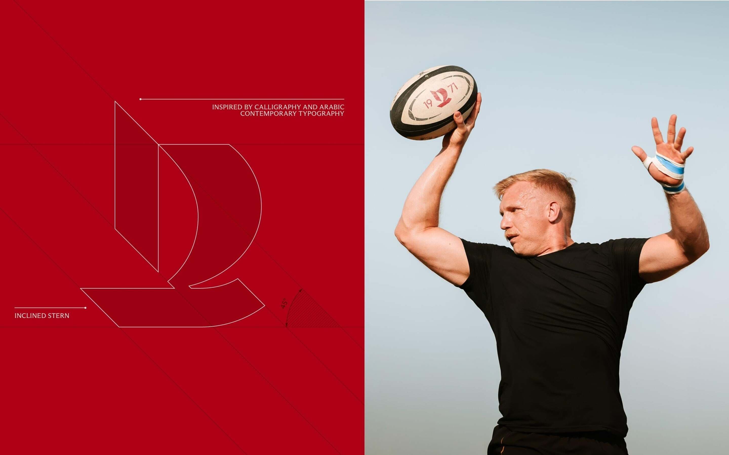
A sail, a journey, a community. At the heart of the brand is a forward-facing sail, a symbol shaped by calligraphy and the sea. It reflects Bahrain’s maritime heritage and the journeys of its members, capturing momentum, unity, and belonging in a single, purposeful mark.
:A FLEXIBLE FAMILY OF LOGOS
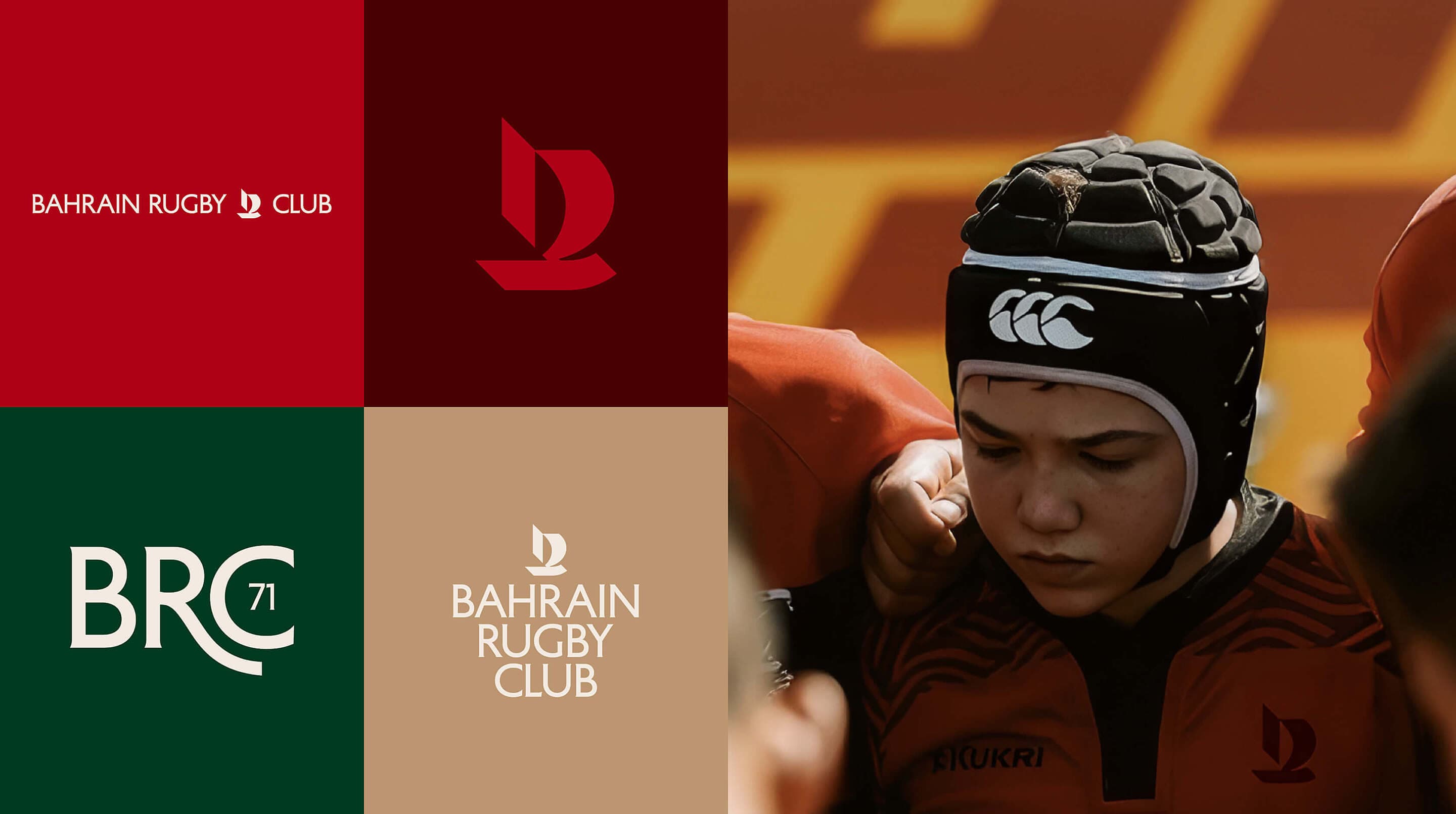
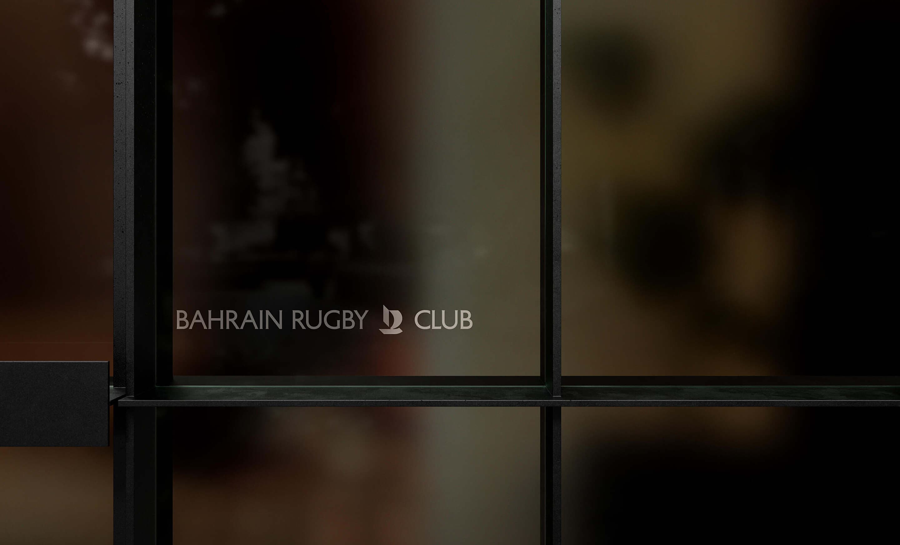
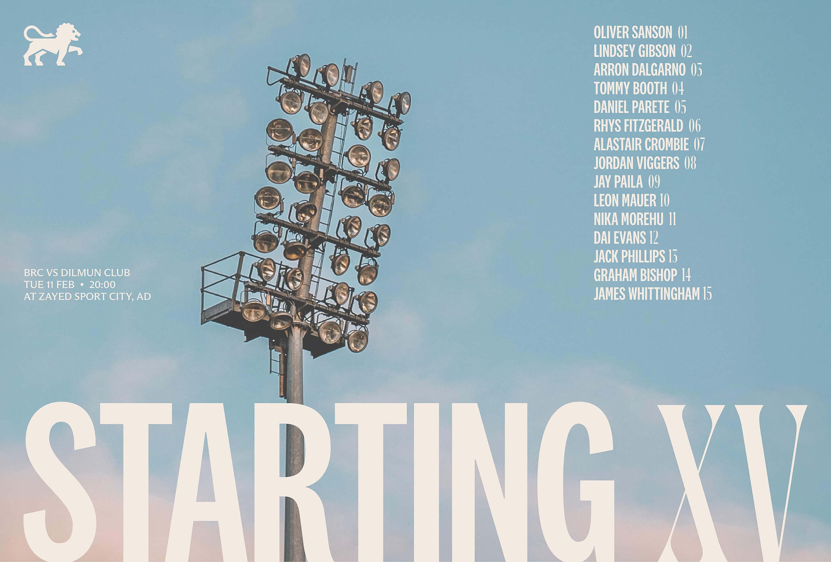
BRC needed an identity that could adapt across formats without losing coherence. From kits to signage, every logotype and mark was designed to scale with clarity. Each variation shares the same visual DNA, creating a system that holds together across contexts - consistent, flexible, and built to move with the club.
_A SYSTEM ROOTED IN HERITAGE
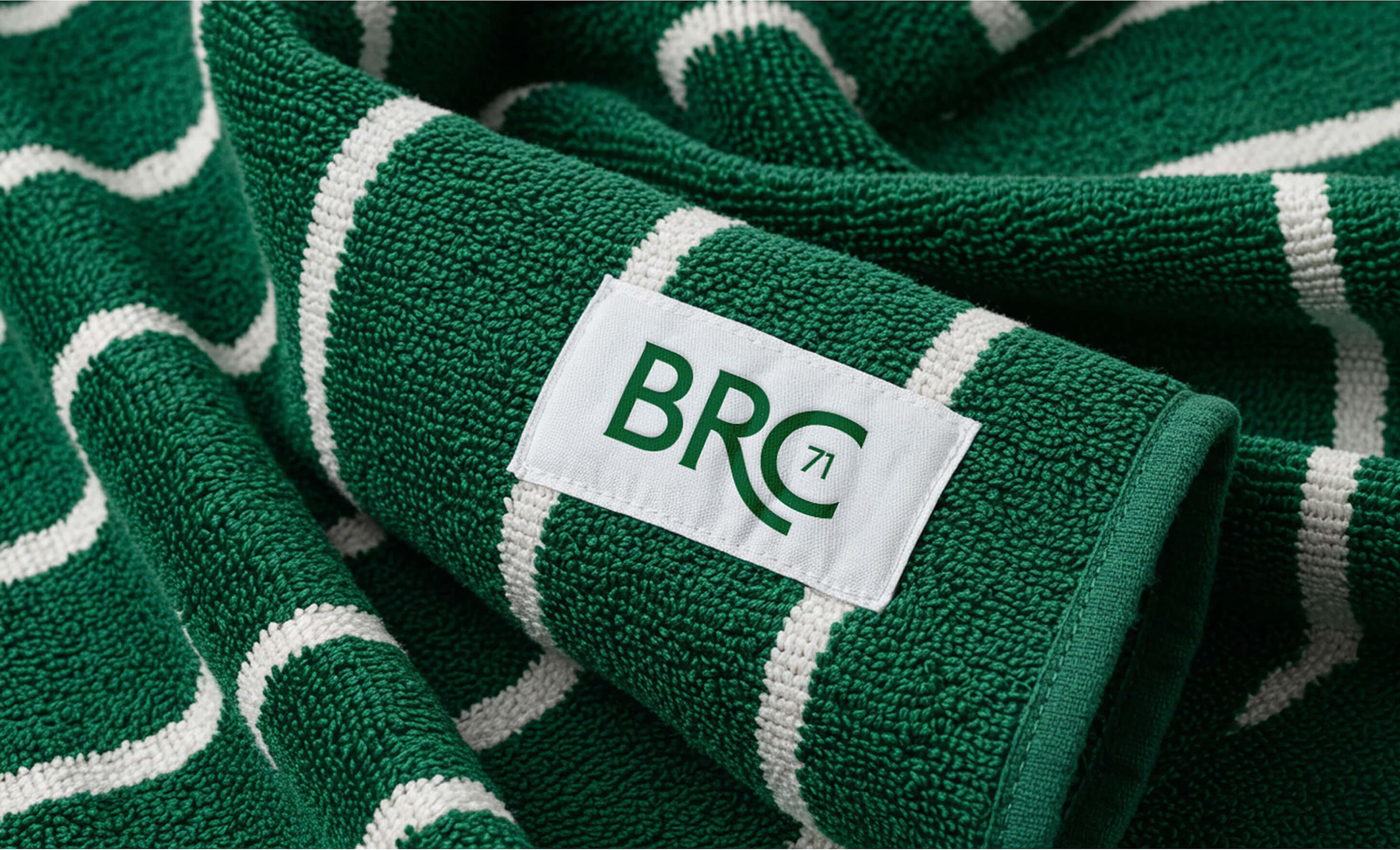
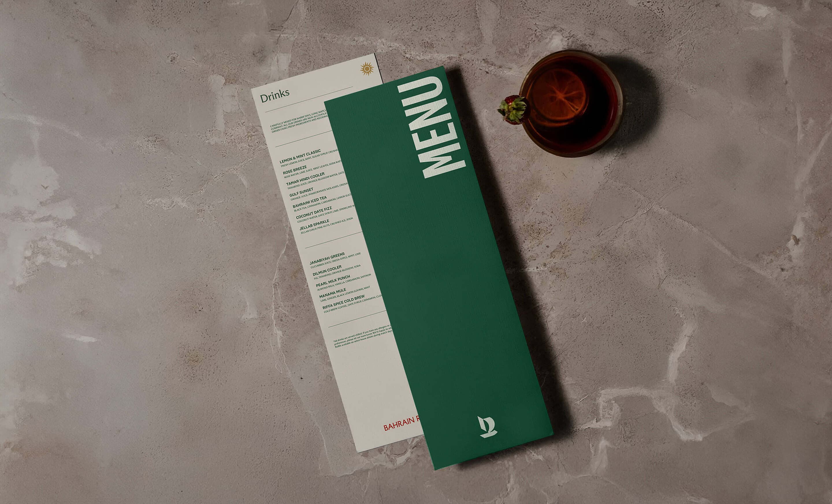
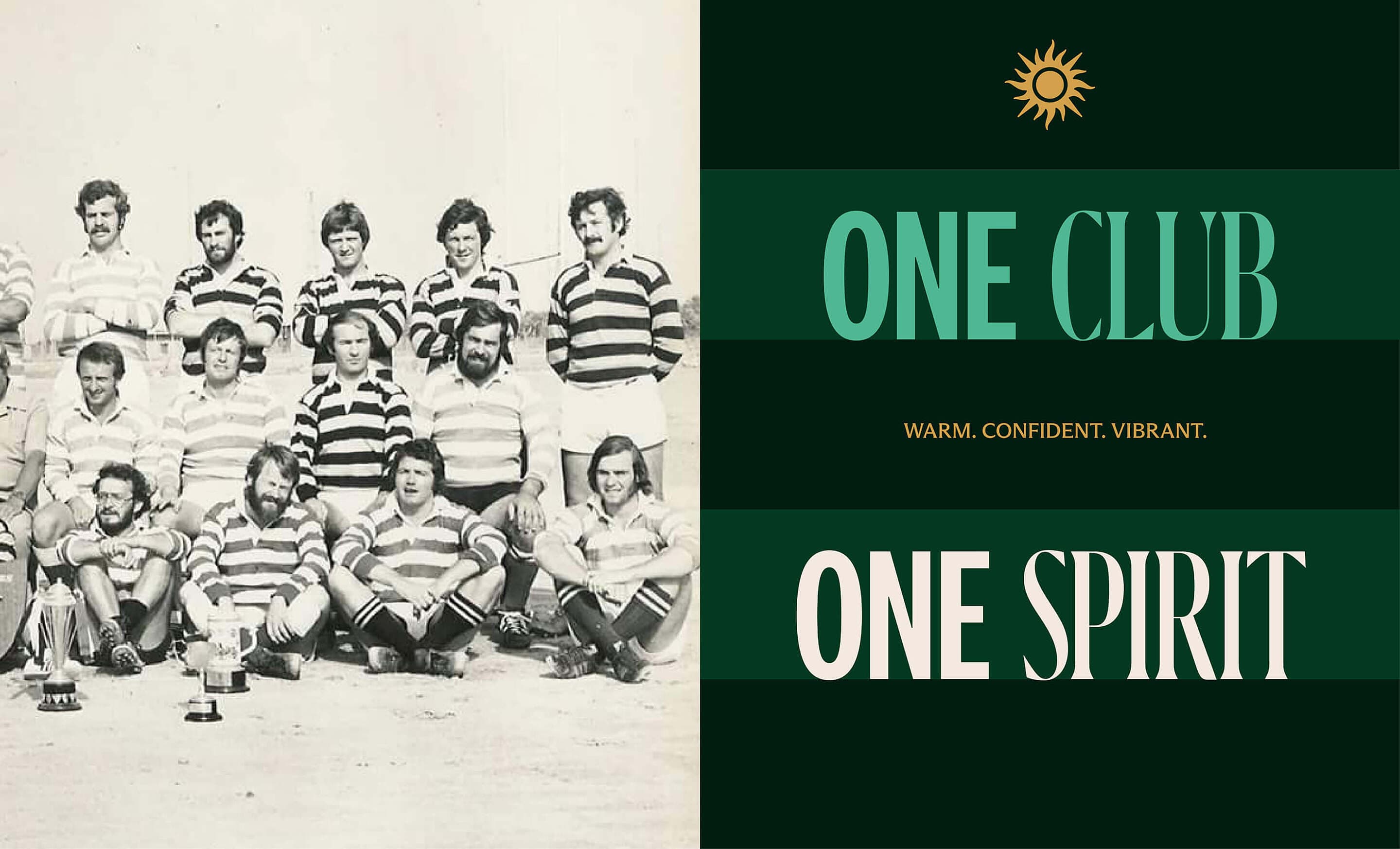
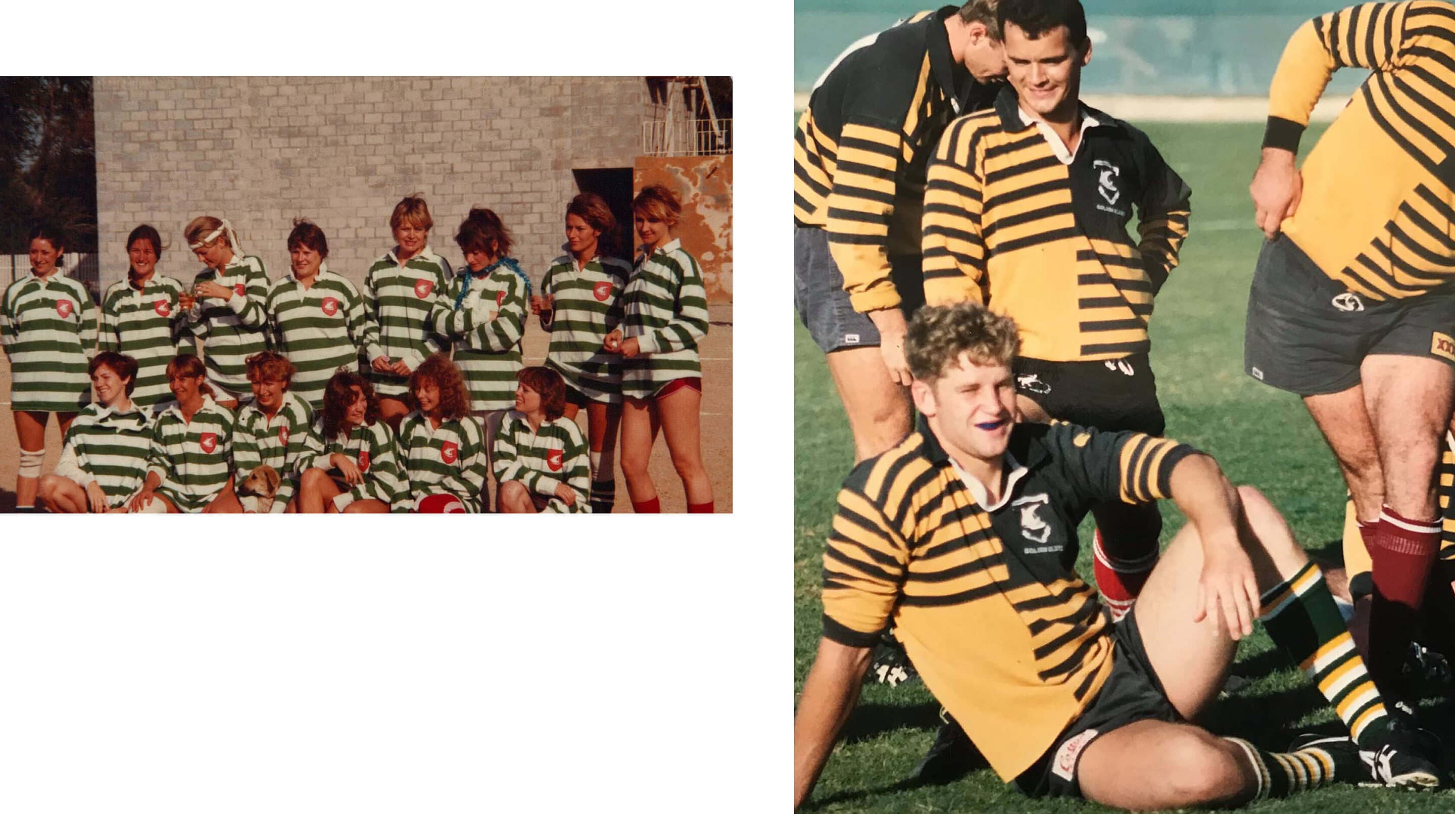
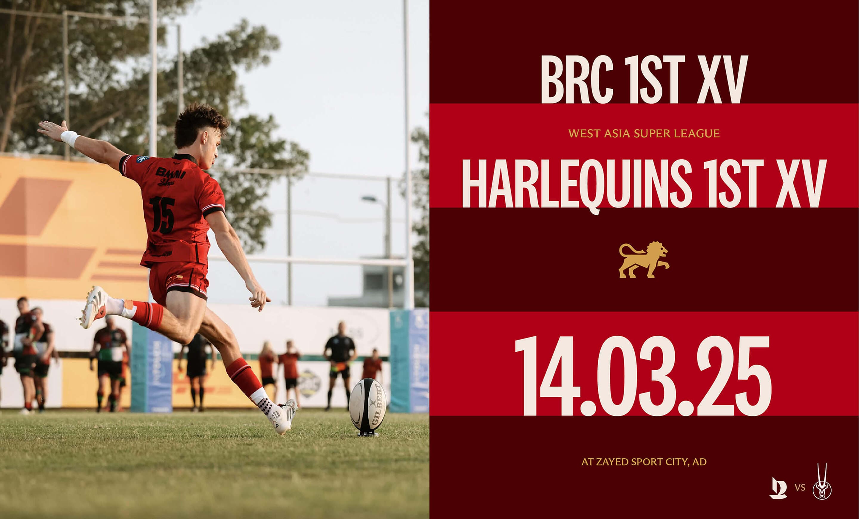
The design system takes its structure from the club’s past. Inspired by the striped kits worn by early members, we developed a five-line grid that anchors the entire visual language, creating rhythm and order across applications. The colour palette follows the same path: deep reds, greens and refined golds reinterpret historic tones while drawing a direct connection to Bahrain itself.
/TYPE IN HARMONY
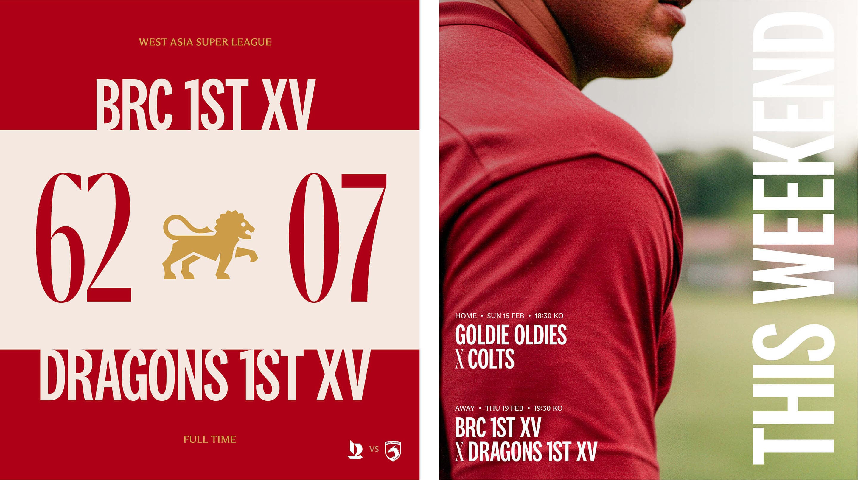
The typographic system where each style plays a defined role - from compact headlines to open, legible body copy - creating a balanced hierarchy across the system. What holds it together is harmony: a measured contrast of weights and proportions allows the system to remain consistent, adaptable, and quietly distinctive. Each typographic style was chosen to serve a purpose, establishing hierarchy, guiding pace, and reinforcing the club’s identity.
:SYMBOLS THAT CONNECT
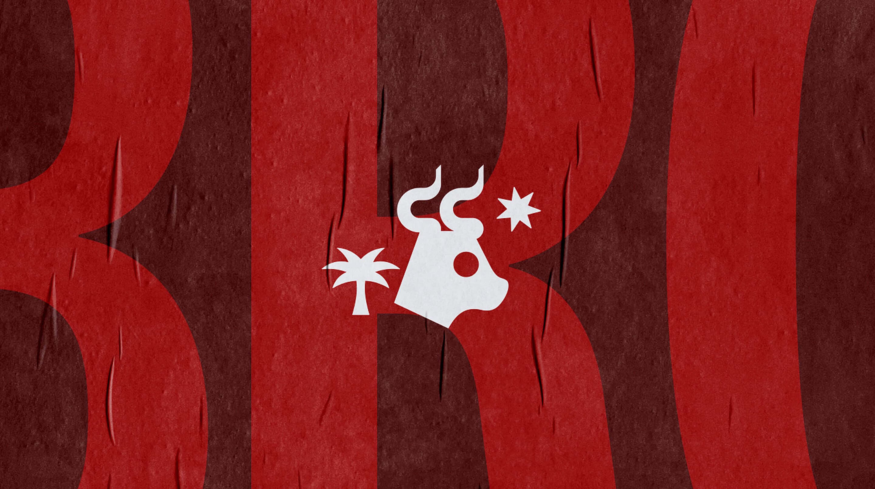
Visual details with deeper roots. We created a set of hallmarks to expand the brand’s visual world - symbols that reference the club’s geography, culture and shared identity. Used across environments and communications, they bring rhythm and richness to the brand.